Data
Here’s a brief description about our sample. We will use a popular dataset that contains information on all the passengers aboard the Titanic.
Table 1
Let’s plot a table with summary statistics.
import pandas as pd
import seaborn as sns
import matplotlib.pyplot as plt

titanic = sns.load_dataset("titanic")
display(titanic.groupby(["sex", "class"])["age"].describe())
| count | mean | std | min | 25% | 50% | 75% | max | ||
|---|---|---|---|---|---|---|---|---|---|
| sex | class | ||||||||
| female | First | 85.0 | 34.611765 | 13.612052 | 2.00 | 23.000 | 35.0 | 44.00 | 63.0 |
| Second | 74.0 | 28.722973 | 12.872702 | 2.00 | 22.250 | 28.0 | 36.00 | 57.0 | |
| Third | 102.0 | 21.750000 | 12.729964 | 0.75 | 14.125 | 21.5 | 29.75 | 63.0 | |
| male | First | 101.0 | 41.281386 | 15.139570 | 0.92 | 30.000 | 40.0 | 51.00 | 80.0 |
| Second | 99.0 | 30.740707 | 14.793894 | 0.67 | 23.000 | 30.0 | 36.75 | 70.0 | |
| Third | 253.0 | 26.507589 | 12.159514 | 0.42 | 20.000 | 25.0 | 33.00 | 74.0 |
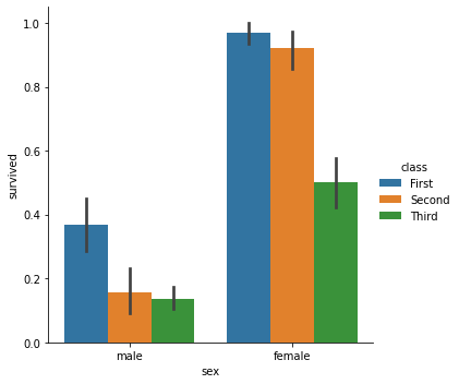
We can also plot our summary statistics.
Supplemental Figure 1
sns.catplot(x="sex", y="survived", hue="class", kind="bar", data=titanic)
plt.show()
